As 2014 comes to a close, it seems like it’s a good time to throw out my thoughts on what I think the trends in website design are going to be in 2015. Many of them began their rise in popularity over the past couple of years, and I predict they will continue to grow.
Flat Design
The term “flat design” refers to a minimalist style in website design. Instead of bevels, drop shadows, textures and gradients on the page, that make things look as though they are “lifting off” the screen, flat design involves removing these stylistic devices that in the past gave things a three-dimensional feel. Instead you are left with a page that feels “crisp” and modern, and more importantly allows the visitor to a website to focus on what is most important – the message and the content, with styling provided by basic elements, flat colors and modern typography.
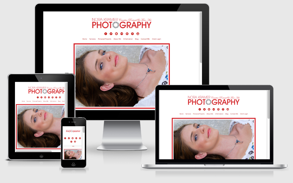
This type of design also makes it easier to create websites that are responsive, so that they display equally well from large computer screens to small mobile devices. By forgoing large graphics that reduce to a size so small they are illegible on smaller devices, flat design loads faster and resizes easier, while still remaining sharp on hi-definition monitors.
Responsive Design
Let’s face it, more and more people are surfing the web on small devices, such as tablets and phones, now, so proper website design needs to cater to all end users, not just those sitting at a desk staring at a large monitor. It is becoming increasingly important they website are optimized for viewing on any screen size a visitor may be using.
Sites being built in 2015 are going to have to be able to adapt for smartphone and tablet users, as well as still look good on larger computer monitors. We know this going to continue to grow next year, for sure.
And, as more people are viewing things from tinier screens, the flat design mentioned above becomes more necessary for legibility.
Scrolling Instead of Clicking
I recently had a client tell me that he thought their home page design was too long. He also used the term “above the fold,” which made me shake my head, because there is no fold in website design – the web isn’t a printed newspaper! Anyway, I didn’t feel it was too long myself, especially given the fact that scrolling, instead of clicking, has been a growing trend in 2014 and will continue to grow in the new year.
This goes back to the fact that more people are accessing website on tablets and mobile phones. Clicking on these devices is cumbersome, and users prefer to scroll, since it is so easy to do with your finger. Think about how you use Facebook and Twitter on your mobile devices. You are constantly scrolling on them. It’s just something that we do now.
To quote John Herman, in a Twitter message regarding the use of scroll-heavy design, “If there’s one lesson to take away from every major change in how people browse the internet over the last five years…it’s that users hate to click and don’t mind scrolling…Clicking is a choice, like jumping; scrolling is inevitable, like falling.”
I recently ran across a great read about why “pageless” website design is the future of the web. The author does a really nice job of explaining why he feels it is the wave of the future in design.
Better Typography and Large Fonts
In years past, web designers were hampered by a small choice of fonts in their web designs. This is because not every single computer is going to have the exact same fonts installed, so if you designed a website in a specialized font, you had to create backup font sets to make sure users who didn’t have the main font you specified would still have a fairly decent rendition of the type of font used, should they view your site.
But, the proliferation of web fonts has made website designers much happier in more recent years. Rich web typography started in around 2008 and is now coming into maturation.
I see larger fonts also continuing to pop up in website design in 2015. Big typography in website design would include body copy that is larger than 18 points, navigation type larger than 14 points, headers larger then 30 points, and banners larger than 50 points. And much of this stems from responsive design, mobile and app design and flat design trends, because they all focus on usability.
Fonts must work on every screen size now, from desktop to tablet to mobile. Users must be able to read them quickly and make actionable decisions quickly.
Buy now. Click here. Submit. These phrases influence typography and encourage designers to go bigger. And, the more website visitors interact with bigger type, the more they come to expect it.
Ghost Buttons
Ghost buttons are exactly what they sound like. Subtle buttons that aren’t distracting when viewing a page. They are transparent, have a recognizable shape, contain light sans serif fonts, and usually have a thin border. They forgo the shading and dimensional feel of buttons in the past. Some great examples of what I mean when I say ghost buttons can be found here.
Parallax Scrolling
Parallax scrolling is a web design technique where the foreground image moves “over” the background image. It can add some pizzaz to a page and give it a “wow factor,” but it’s very important not to over use this, as many people did when it first came out. There is such a thing as “too much” of a good thing.
If you go to my home page and scroll, while watching the large main image, you will get an idea of what parallax scrolling means.
In order for websites to compete and convert in 2015 they must be modern, responsive and easy for your readers to use. That does not mean they need to include all the bells and whistles (which frankly would be rather much for most sites), but they must keep up with the times and not look like they were built ten plus years ago.
- How a Boutique Web Design Agency Offers More Personalized Service - June 23, 2025
- When Should You Redesign Your Website? 7 Warning Signs - June 20, 2025
- We’re Honored: Named One of the Best Web Design Blogs in Florida by FeedSpot - June 10, 2025


