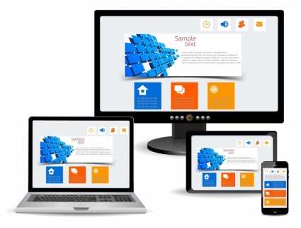
Responsive website design. If you have been looking to hire a website designer or developer recently, I’m sure you have run across the term “responsive website design” more than a few times. You may be wondering exactly what the term “responsive website design” means. A lot of website developers like to throw the term out there, but they don’t take the time to explain what it means to the average person.
Responsive website design (RWD) is a design approach that is aimed at creating websites that provide an optimal viewing experience for the end user. The website dynamically resizes itself based on the type of device being used to view it. It does this to help reduce the panning and scrolling that would need to be done on a fixed width design, should someone visit the website from a smaller device like a tablet or mobile phone. A site that is designed to be responsive will adapt the layout to the viewing environment, using proportional grid designs, flexible images and CSS3 media queries.
Why is Responsive Web Design Important?
Because more and more people are using mobile devices, such as tablets or phones, for everyday web browsing. Things that used to be able to be done only on a computer, like booking flights or paying bills, are now increasingly being done on smaller handheld devices – “pocket computers” that people have with them all the time. People now use their smaller devices for social media, emails, and even online shopping.
As people become more adept at using the internet from these devices, even companies who don’t fall into one of the categories above are starting to see increasing traffic from them to their websites.
Mobile usage is increasing on a yearly basis. Here are some stats from Smart Insights for 2014:
- 89% of users spend time on social media through mobile apps and 11% spend their time on it through the use of mobile web.
- 48% of users start mobile research on their devices on search engines, while 33% start on branded websites and 26% use their branded mobile apps.
As you can see from the stats above, while people are using mobile “apps” on their smart phones and tablets to get online, they are also using branded websites with these small mobile devices at a very high rate. As a matter of fact, at an increasing rate.
Google Prefers a Responsively Designed Website
Google even prefers responsive website design as the recommended mobile configuration. Why? It’s more efficient for Google to bot crawl the website and then index all the content that is online. With responsive design, websites have just one URL, and the same HTML across all devices. When a business is building two separate websites, one for desktops and one to cater to their mobile users, then each will have a different URL and different HTML. This forces Google to do double the work and could, in fact, be hurting your search engine rankings by causing you to be penalized for duplicate content, something Google highly frowns upon.
Responsive Design Appeals to Web Surfers

This does not mean that your website simply becomes a mini version of itself either. This could potentially cause your visitors to have to grab a magnifying glass or reading glasses just to see the teeny tiny type! Responsive layouts will actually look slightly different, depending on the device being used, while maintaining legible typeface sizes and only scaling graphics down, if needed. They actually adapt to the device being used, while still maintaining the same content and the branding of your company.
To get a better understanding of what “responsive website design” means in the real world, have a look at my website from a desktop or laptop computer, then open it up on a tablet or iPad, and again on your mobile phone. Compare all the versions side by side. My site was designed to adapt to the device it is being read on.
In short, responsive design can do the following for you:
Create a better user experience.
Since viewers don’t have to scroll, shrink, pan and zoom to read the content on your website, their overall user experience is much better.
Your website will be easier for you to manage.
Because you are using just one website that adapts as needed, and not having to maintain two or more sites to accommodate several different devices, managing your website will be much easier for you.
Reduce any harmful SEO benefits you may be losing.
By having more than one URL and two or more websites with duplicate content, you may be harming your SEO rankings. A responsively designed website will combat that side effect of trying to appease all types of visitors to your site.
Help you to stay ahead of your competition by serving up your information to more users.
Many people surfing the web now prefer to do their computing on smaller devices, rather then on traditional computers, a responsive design put you ahead of your competition, since you can serve up a website that work on all devices as nicely formatted as possible for the device.
- How a Boutique Web Design Agency Offers More Personalized Service - June 23, 2025
- When Should You Redesign Your Website? 7 Warning Signs - June 20, 2025
- We’re Honored: Named One of the Best Web Design Blogs in Florida by FeedSpot - June 10, 2025


