If you watch your analytics you may see a term called “bounce rate” and wonder what exactly that means. Your bounce rate is the percentage of visitors who navigate away (bounce away) from your site after only viewing one page.
And, while there can be a variety of reasons people may exit your page, such as it answered their question and they didn’t need to look any further, there are other reasons they may be hitting the back button quickly as well. And, our goals should always be to keep people on our sites as long as possible.
I did some mini research on the web to find the most common reasons people will leave a website and you really need to assess your site to make sure you aren’t doing these things yourself.
Certainly, one or two of them on their own might not be enough to turn off a site visitor. But, if you couple several together, you could inadvertently be driving people away.
1.) Music That Autoplays
Not only is auto sound so 1999, but it tends to drive a lot of people off websites immediately. Some people may be visiting from places where they don’t want sound to blast out of their speakers unexpectedly, like at work, in a shared workspace or library, or in a doctor’s office. I know I like to browse the web in bed at night and my biggest pet peeve is when I go to a site and sound starts blaring out of it.
2.) Slow Load Times
Slow load times are a killer for some people. Not everyone has the insanely fast internet connection you may have and they aren’t going to stick around for your slow pages to load on their computers. Always try to keep your pages light, so they load quickly. Optimize those photographs and don’t add unnecessary scripts or plug-ins to your site, which will slow it down.
3.) Bad Navigation
Poorly designed navigation is a big turn off to visitors. Your navigation needs to be descriptive, intuitive and very straightforward. If a website visitor has to dig too hard to find what they are looking for they are guaranteed to leave quickly.
4.) Flash-Based Websites
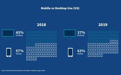
Flash-based websites may have been in vogue ten years ago, but they are no longer the way to go for most businesses. In two words… they suck! Keep in mind, at least 50% of your website visitors are coming from a mobile device these days. They are more than likely totally unable to see your flash-based website, or if their device does allow it to load, it is probably not loading in the way you expect it would, like on a desktop computer.
5.) No “About” Page
So many websites don’t take the time to make an “About Us” or “About Me” page, for reasons I cannot even begin to understand. A lot of times that is the first page visitors will look for when coming to a website. People like to know who they are doing business with. This is too important of a page to leave off of your site. If you don’t have one, get one up today!
6.) Too Much Flashing and Scrolling
Most people browsing the internet don’t want to feel like they are in a nightclub. Sure, flashing can grab attention, but nine times out of ten, not the kind of attention you want. Flashing and scrolling items look desperate, attention seeking and are annoying to most people. And, frankly, for the most part, they look very amateurish.
7.) Typos and Poor Grammar
Yikes! Typos are a pet peeve of mine and when I find them in my own work I cringe. Poor grammar also sends shivers down my spine. Mostly because it showcases your attention to detail, or lack thereof. Please double check your text, or even try to get a second set of eyes on it if possible. While most of us realize a typo or two can slip through the cracks, when someone visits a site that is riddled with them, it gives them a poor impression of your business/website.
8.) Sites With Poor Color Contrast Choices
Poor color combinations can make a website very difficult to read. For instance I recently ran across a website that had a black background (by far my least favorite choice for a background color) and grey text for the body copy. You have no idea how difficult that was to read for me. If people can’t read something they are going to leave the site quickly. Not much point in sticking around.
9.) Websites That Aren’t Responsive and Mobile-Friendly
More and more people are visiting websites from tablets and smartphones. Websites need to be responsive and mobile-friendly. If a site doesn’t automatically resize for the device they are viewing it on, chances are the visitor is “out of there” quickly.
10.) Cookie Cutter Websites
The prevalence of templates makes it easy for people to get their website or WordPress blog up and running quickly. But, templates are templates and, unless you do quite a bit of modification and customization your website, they can easily look like dozens or even hundreds or thousands of other websites out there.
Do you really want to have people think you are a copycat or don’t care enough about your business website to put some time into it? If you are using a templates make sure you customize it and make it your own. Be sure that you brand it to compliment your business.
If you can’t do it yourself, hire someone who can.
Photo Credit: tedgresham997 / Pixabay
- How a Boutique Web Design Agency Offers More Personalized Service - June 23, 2025
- When Should You Redesign Your Website? 7 Warning Signs - June 20, 2025
- We’re Honored: Named One of the Best Web Design Blogs in Florida by FeedSpot - June 10, 2025


