
Many research surveys have shown that today most people with an internet connection spend at least 5 hours of their day hooked onto their smartphones and at least 50 percent of them have recently discovered new products via their smart devices. As a matter of fact, there is a very good chance that you are actually reading this very article on a mobile device right now!
Unfortunately, there are still many designers who still insist on designing websites for desktop computers instead of optimizing them for mobile. The former approach does not work well any more than a square peg can be inserted into a round hole.
This is why there is no point in trying to create a website for desktop and force it to work for entirely different technology i.e. mobile. Fortunately, you can create a website for the smart devices that most people are currently using and the same site will work on desktops as well.
Google Has Spoken
The powerful Google search engine has made it clear through its latest algorithms that mobile-first is pretty much how it sees things. The latest updates reward mobile-friendly sites by boosting their rating so that they end up in the top ten results of the iconic search engine.
From the marketing point of view, it makes plenty of sense because there are an estimated 5 billion online mobile users at the moment. Their collective buying power has made it very clear that this trend is not going to disappear any time soon.
Let us check out the key reasons why mobile websites are so important for the coming years.
1.) More People are Using Mobile Devices
This is by far and large the single most important factor for converting to a mobile-friendly website. Today, the vast majority of people are going online not through traditional desktops but via smart devices such as smartphones and tablets. If you want your customers to respond to you, you should reach out to them through a medium that they use a lot, otherwise you can miss out on many important sales.
If your customers are forced to visit your desktop optimized site on a mobile platform, the experience will be cumbersome and it is very likely they will switch to your competitors.
2.) You Can Build a Whole Lot of Trust
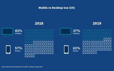
According to a survey conducted by the BrightEdge research company back in 2017, more than 57 percent of web users have been logging on to websites via their smart devices. This percentage has drastically increased in the past few years. The survey also reported that most of these smartphone users were not willing to recommend a business that hosts a poorly designed mobile website. In short, website owners can actually lose customers if they don’t fix their sites and make them more mobile-friendly.
3.) Increase Your Visibility
Increased visibility is one of the very best things about having a really unique and mobile-friendly website. The higher the visibility of the site, the greater will be your ability to reach out to a wider audience. A highly responsive website has multiple social media buttons embedded into the site itself making online sharing a very simple exercise. The visitors of your website will be more likely to share your site on their respective social platforms if the buttons are placed conveniently at their disposal.
Add to that the fact that a responsive website is virtually a free method to rank better on not just Google alone but also several other popular search engines. And, of course, the more organic search results that link to your site, the higher the probability of generating quality leads and subsequent conversions.
4.) A Mobile Website Can Help Focus Consumer Attention
Today’s digital age has ushered in an era of near-instant gratification. This means that many customers now have a really short attention span and even that is getting shorter with the passage of time. If desktop based sites open too slowly for the customers, they will lose their patience and find other faster and more responsive sites.
One of the most endearing concepts of a mobile-friendly website is that it will almost always load more quickly than a site optimized for a desktop system. You simply cannot afford to have any website that will take a lot longer to load, because your target audience will leave your page instantly.
According to research, it has been conclusively proven that over 50 percent of mobile web users leave a site if it takes longer than three seconds to load. In a nutshell, if you don’t go for a responsive mobile website, you can easily lose a big chunk of your business.
5.) The Smartphone First Index
It makes a whole lot of sense to go for the mobile-first index approach due to the massive number of Google voice searches that now routinely take place on smartphones. This means that not just the content but also the links of a mobile-friendly website — among several other factors—are the key drivers for extra visibility on any search engine. Apart from that, the speed of your site as well as the overall user experience will help increase your ratings.
6.) A Universally Better Browsing Experience
The overall customer experience is the crucial difference between a highly responsive mobile-friendly website as compared to a straightforward desktop one. The former gives your website visitors a very appealing and visually enjoyable encounter with your business and the products that you promote. This has a lot to do with the fact that onsite navigation is both simple and very intuitive. When you’re using a mobile-friendly website, you will also be able to share content both naturally and easily. Best of all, the website will load much faster and both the graphics and the text will be easy to read, and it will fit well on the small screens of the more common smart devices out there.
7.) It Will Be Much Easier for the Customer to Get in Touch With You
Convenience matters a lot when it comes to selling to your customers. If it is easy for them to reach you, they will be likely to take the plunge. Having a mobile-friendly website basically means that your phone number, your email address, and other contact details are both easy to find and are also clickable. In an ideal situation, the customer simply has to click on an icon and your phone should start ringing. In the long run, it will be better for your customers and it will end up paying rich dividends for your marketing strategy, thanks to increased sales.
How to Check If Your Site Is Optimized for Mobile Usage
 Google has a large number of tools for testing mobile usability. In fact, the engine’s search console can also generate a mobile usability report that will detail problems page by page.
It will be very helpful if you were to utilize these tools while you try and develop your site. You can use the search console option to keep tabs on the various issues that you might face throughout the service life of the new site.
Google’s search console can find and suggest a solution for the following mobile optimization and usability issues:
Flash Software Usage
Most of the common mobile browsers are not able to render Flash animations. You should consider switching to an alternative system or get rid of the animations altogether. This is because they can slow down an application and thereby defeat the very purpose of your website.
Say No to Full Pop-Up Screens
A full-screen pop-up looks bad and it is also considered to be in poor taste. Few users like a giant pop-up taking over the whole screen of their mobile phone. Not only do people get irritated by such screens but this is also very off-putting for your users. Moreover, Google has now unveiled algorithms that will detect such pop-ups and push the rating of the site down so that it does not make it into their coveted top ten rankings list.
Viewport Configuration Issues
The viewport meta tag helps different browsers in scaling down a page in order to suit a specific smart device. If it is not configured properly, the size of the page will be adversely affected whenever it is viewed on a mobile phone or similar device.
Fixed-width Viewport
This problem occurs when the site attempts to circumvent mobile design by generating fixed width pages. It will cause the user to manually scroll from one end to the other to read the text. It should be shelved whenever you adopt a responsive and mobile-friendly design, otherwise, the site won’t work properly.
Small-Sized Fonts
This is largely a scaling issue and, if not rectified in time, it will cause considerable stress to the users as they will be forced to pinch the screen in order to zoom in and read the text.
Content Not Sized to the Device Screen
In this scenario, the actual page content does not fit the screen size of the window and the site user has to scroll up and down. Creating relative screen sizes to accommodate different devices can also help to fix the issue.
Touch Elements Are Too Close to Each Other
This is a fairly common usability issue whereupon it is very hard to tap any given element on the site without accidentally hitting a neighboring element.
Rest assured that if you were to optimize your site by removing these troublesome issues, it will have a positive effect on how Google grades the overall usability of your website. Furthermore, your site’s visitors will also have a much better end-user experience. This is a win-win situation for everyone.
Page Loading Speeds
Page loading speeds are certainly important for the full spectrum of internet-capable devices. However, they can be critically important for mobile phones since the users are very likely to be looking for quick answers to their issues.
For example, a page that might load very quickly on a dedicated Wi-Fi network might not be quite so fast and snappy when it comes to downloading a site on a mobile data network. 4G capability has certainly been able to deliver tremendous speed improvements, but there are many places where such coverage is not taken for granted. Moreover, users don’t always have network packages that offer blazing fast speeds. Should the page loading cycle end up being heavily delayed, the user may be tempted to close the site altogether.
That said, there are many different practices for improving your site’s page speeds. Additionally, Google has created multiple page speed insight tools that can not only help you figure out why your pages are loading so slowly but can also help you handle this problem easily. You can use them to assess how fast your site pages load and in case the speed is slow, you will also get some tips on what you can do to improve your overall score.
Some of the common solutions include the following:
- Leverage browser and data caching
- Eliminate render-blocking JavaScript
- Minify CSS
- Enable compression of the data
- Optimize onsite images for mobile-friendly sites
Conclusion
The creation of mobile-friendly sites ensures that putting in some serious work on such sites can help you get an edge over your competition. It will take time and effort but there is no substitute for a friendly and responsive mobile-friendly website platform.

Mobile friendly websites, mobile websites, mobile-friendly website, mobile-friendly website platform, Responsive mobile websites
- A Step-By-Step Guide to Designing a Mobile-Friendly Website - November 11, 2024
- How Content Marketing Enhances Your Website’s SEO Performance - November 11, 2024
- How to Pick the Perfect Color Scheme for Your Website Design - November 11, 2024