Did you know that 75% of user perception about your brand’s credibility is completely based upon your website design? It takes less than five seconds for a potential consumer to judge your business based on web design.
Open your website and ask yourself these questions: Can your target audience determine what you do within five seconds of being on the landing page? Is the pricing layout easy to understand? Is navigating sections such as blogs, products, and services easy for users? Does your website have a low bounce rate?
If your answer to any of the aforementioned questions is “no,” your website either has a non-responsive design, hidden navigation menu, cluttered layout, lack of color contrast, or inconsistent typefaces. To put it simply, it is time to redesign and optimize your website.
In this article, we will be discussing amazing website design tips to revamp your old web page into a new, more efficient one. So, without any further delay, let’s begin.
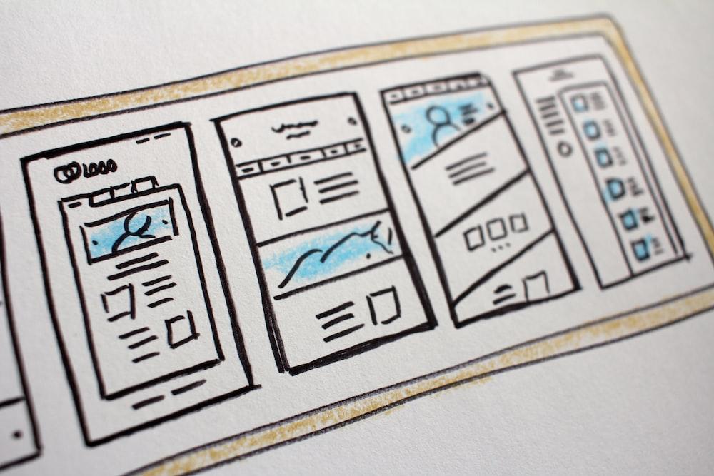
Start with the Layout of Your Website
A website cannot succeed with thought-provoking copy or a compelling web design alone. In order to stand out, a website design needs to have a style that promotes user experience and functionality while being easy to understand at first glance. So let’s start with website design tips on how to improve the layout and structure of web pages.
1. Leverage the Visual Hierarchy
Visual Hierarchy is a fundamental part of an intuitive website design. It refers to the arrangement, color, size, and contrast of a web page’s visual elements. Having a proper visual hierarchy helps in displaying the content in an easy-to-understand and effective manner. In simpler words, using the visual hierarchy in your website design will make it easier for you to lead the visitor’s attention to specific and vital elements of the site. The two critical elements of the visual hierarchy are as follows:
- Element Placement: Use the right website layout to ensure the user’s vision is steered in the right direction. For example, place your logo at the header.
- Weight and Size: Highlight your brand’s greatest assets, such as the logo and name, by making them bold and more prominent in size.
A standard web design layout includes sizes (small or big), positions (low or high on the page), contrast (white space or colors), and visuals (icons, images, and videos). For example, a big video on top of the web page will get every user’s attention. No one will read the small-sized text at the bottom of the site. This makes it essential for you to make sure that your website design follows the principles of visual hierarchy and guides the consumers to the call-to-action.
2. Use Keyword-Focused, Descriptive Headlines
The second most important website design rule is to ensure that the headlines on the top of the homepage are descriptive. If not, the user might not be able to find answers to their question, because of which they might have a problem navigating around.
The simplest way to do this is to use relevant target keywords. Therefore, instead of writing a clever and vague heading, write something clear and descriptive to ensure that the consumers know what you do as soon as they land on your website.
Remember: descriptive doesn’t mean lengthy. Headlines should be crisp, include relevant keywords, and communicate the message efficiently.
3. Correct Spacing and Grid System
Another thing that you can do to grab the viewer’s attention is to leave ample white spaces around important texts. This helps the prospects in focusing on the essential text. On the flip side, never use whitespaces around unimportant text, as this might mislead users.
4. Stick to Standard Web Design Layouts
In 2021, Google conducted research to find out what kind of websites are considered visually appealing by users. The study’s results proved that complex web designs are not perceived as beautiful. Therefore, if you want your site to be liked by customers, try to follow the standard website design layouts.
However, this doesn’t mean there is no room for a creative website. Consider the standard layout as the skeleton and build your website design upon it. This gives you the freedom to be as creative as possible while ensuring that your website is customer-centric. Here is what a good web design with high prototypically includes:
- Mobile responsive design.
- Logo on the top left corner of the website.
- Social icons at the bottom.
- A search bar at the top.
- Horizontal navigation in the header.
5. Don’t Place All Calls-to-Action at the Top of the Webpage
Even though most visitors might spend more time on the top of the homepage, according to a report by Chartbeat, most engagement happens below the fold. While placing content on the top is essential, putting all the call-to-actions near the top of the website design isn’t effective. Therefore, make sure to strategically place the call-to-action farther down the web page.
6. Minimize the Number of Tabs and Accordions
One of the smartest website design tips that no one would have told you about is to minimize the number of expandable boxes and tabs on your site.
With more than 75% of users scanning your website, you have to make sure that all essential information is within their reach. In simpler terms, a user will be more comfortable scrolling the web page than clicking on a tab to see something specific.
7. Avoid Rotating Sliders and Carousels
Although homepage slideshows have been widely popular and loved by digital users since the beginning, there’s a downside: potential customers might only see the first slide and skip the rest.
Several studies have proved that users are less likely to read messages on subsequent sliders and even click the call-to-action. Here’s what you should do instead:
- Use the most impactful slide as the featured image and add a call-to-action.
- Stack the slides so it will be easier for the visitors to view them as they scroll down.
Select the Right Visuals
Does your website look like a mood board with cluttered images? Here are some web design tips to help you in placing the pictures strategically:
1. Use Images of People, But Not Stock Images
Using images of people in your website design makes it look more credible and creates a strong connection with your brand. Faces don’t only get you much-needed attention but will also correlate with conversations.
A study by Basecamp showed an increase in lead generation just by adding images of people and testimonials to the sales page. Using images of people gives your web page a personal touch and builds trust.
Pro Tip: Avoid using stock images of people. Instead, use pictures of real customers.
2. Use Arrows as Visual Cues
Even though faces can divert the client’s attention to the right places, they aren’t as effective as simple hand-drawn arrows. So, if you want your target audience to look at something on your website, point an arrow at it.
3. Use Fonts and Colors to Guide Visitors
Colors have the power to change your actions, manipulate your thinking, and cause reactions. Having different characteristics, each color can either district or attract your mind, tranquil your eyes, suppress your appetite, and can even increase your blood pressure.
Website design tips guide us to start by picking two or three base colors for your website and make sure that elements such as text, button color, and images contrast with the background.
Similarly, if you want to make your website readable, use only two or three sans-serif typefaces like Verdana and Arial. Also, stick to only two or three font styles, as they play an instrumental role in setting the hierarchy for your website.
Pro Tip: Select one action color for all the buttons, links, and rollover effects. Make sure that the color is distinct from the brand colors.
Improve and SEO-Optimize the Writing
Now that the layout and structure of your web design are ready, it is time to move to the second most important element of your digital storefront – content. Here are a few to make your web copy stand out:
1. Write Meaningful, Attention-Grabbing, Engaging Headings and Subheadings
Just like we recommended keyword-focused headlines, writing meaningful and descriptive subheadings is equally important.
For instance, is it easier for you to know what the brand is offering by reading the subheading of “services” and “products” or by the subheading like “Clothes and Shoes?” The latter, right? Writing descriptive subheadings improves the usability and accessibility of the website.
2. Use Simple Words
When drafting content for your website, remember that you might be the expert in your industry, but your customers aren’t. Therefore, avoid using jargon as they are difficult to understand and might make the look of the overall website design complicated.
Here is what happens: When something is difficult to read, most users find it either time-consuming or risky. As a result of this, the consumers might end up leaving your website.
In fact, research has proved that using simple language and bringing down the readability levels can increase the success rate of websites. So, when you are creating a web copy, remember that while a fancy word might portray you as smart, it will make your consumers feel dumb.
3. Avoid Writing Long Paragraphs or Sentences
Long sentences or paragraphs don’t align with the best practices of digital content. So, start breaking up long, blocky paragraphs into smaller ones. The rule of thumb here is to ensure that a paragraph isn’t longer than 3 to 4 lines.
4. Place Important Information at the Beginning and End of the List
When creating a list within your web copy, place all the important stuff at the beginning and the end of the website design. Primarily because the attention of the readers is least in the middle, the only thing that stays with them is the items that they read at the start and end.
Incorporate Navigation and Links
With your content and website design ready to be published, we will now teach you how to include navigation buttons, links, and menus on the web page.
1. Make Sure to Place the Home Button on the Left
The top left corner of your website’s landing page is where the users expect the home link to be. So, place the home button there as it also gets the most attention while the view scan’s your website.
2. Be Descriptive
Being visually prominent, navigation gives you an opportunity to talk to your customers. A typical user will start scanning your website from the header. Keeping this in mind, make sure that the drop-down menu is somewhere near the header. Furthermore, avoid using generic labels and opt for descriptive navigation labels, as they can improve your overall search engine ratings.
3. Carefully Link Service Pages to Blog Posts
Compared to service pages, blog posts have low conversion rates and more exit opportunities and distractions. The goal of the service page should be to convert a potential buyer into a lead and not to ask them to read a long blog before making a decision.
4. Avoid Using Social Media Icons on the Header of Your Website
Although a common practice, placing colorful social media icons on the website’s header isn’t a wise decision. A single click might take the users to a platform with hundreds of distractions, resulting in you losing a potential client. Instead, add the links to your social media accounts in the header.
Wrapping It Up!
Congratulations, you have finally reached the end of this article. Do yourself a favor and implement these website design tips. Remember that minor changes help improve the experience, performance, and customer conversion rates of your digital storefront.
Here’s one last website design tip before we wrap up: Websites should be beautiful. Look for inspiration all around you and ensure that your website design has an emotional and visual impact on customers.
Helping visitors find what they need is the simplest way to make a website functional and efficient. User-friendliness is not only at the heart of all website design tips in this article but it is also the eternal purpose of web design.
Have fun redesigning your website!
- A Step-By-Step Guide to Designing a Mobile-Friendly Website - November 11, 2024
- How Content Marketing Enhances Your Website’s SEO Performance - November 11, 2024
- How to Pick the Perfect Color Scheme for Your Website Design - November 11, 2024