Sliders, also called carousels or rotating banners, are those rotating text and images seen at the top of a website’s homepage have been all the rage for several years now. Almost every client who has wanted a website built in the past several years feels like they absolutely must have these on their homepage. And, every website designer and developer I know now cringes when they are asked for them.
The Great Slider Debate
There is even a slider debate among website professionals, with most feeling they are a waste of space, and that they give the impression that those using them can’t commit to a good single message to explain their website.
There have also been studies done to determine if they are effective or not. And, I have actually been hard pressed to find a study that says sliders are a good idea for a website and offer it substantial benefits.
According to Chris Goward, of Wider Funnel:
“We have tested rotating offers many times and have found it to be a poor way of presenting home page content.”
We can look as some statistics regarding the use of website sliders and come up with the following:
- They dilute your message since there are multiple message on your homepage.
- The give your visitors too many choice options, which makes it harder for the to take action on your site.
- They don’t work well on mobile devices.
- The moving objects make it harder for visitors to focus.
- They push your content down and Google has mentioned that is not a smart thing to do.
- They make your website load slower, which can impact your SEO in a negative way and hurt your conversion rate.
- Only 1% of people viewing a page that contains them will actually click on a slide, and of those 1% it is almost always the first slide that is clicked on.
- And, they tend to trigger “banner blindness,” so most people simply ignore them. Some people skip looking at them altogether because they look like advertisements.
Furthermore, behavioral scientist Thijs de Valk said in a post he wrote that sliders have proven to be terrible for SEO and are not user-friendly. He goes so far as to say:
“Simply having a slider on your website will get you less sales! If that’s not a deal-breaker, I seriously don’t know what is… It kills your rankings and your conversions!”
And, Google actually agrees with this. In their page layout algorithm improvement, as well as at other times before, they have said that pushing your actual content of the page further down basically ruins your search ranking and that’s what sliders at the top of a page do.
What’s The Alternative? Consider a Hero Image
While some may think sliders look pretty and have cool effects, homepage carousels are basically an ineffective use of space and more website owners are now finding that out and deciding to use a hero image on their homepage instead.
A hero image is a large banner image or graphic, placed prominently on the home page. It often has your company’s brand, name or logo superimposed on it, and it is the first visual a website visitor encounters on the site. It’s purpose is to present an overview of the website’s most important content, convey a brand, or evoke an emotion or feeling from your visitor.
Usually a hero image will be a hi-res photograph directly related to the company’s brand or the content of the website, but some designers have also worked with vector backgrounds, illustrations and even video. Hero images strongly focus on a visual, and many times feature simple typography and minimal color choices.
“Hero banners” are becoming a growing trend as well, replacing traditional navigational menus on home pages. They feature large “in your face” images, where branding, navigation and other tools are placed along the top, bottom of sides of the image, while still keeping the focus on the image itself.
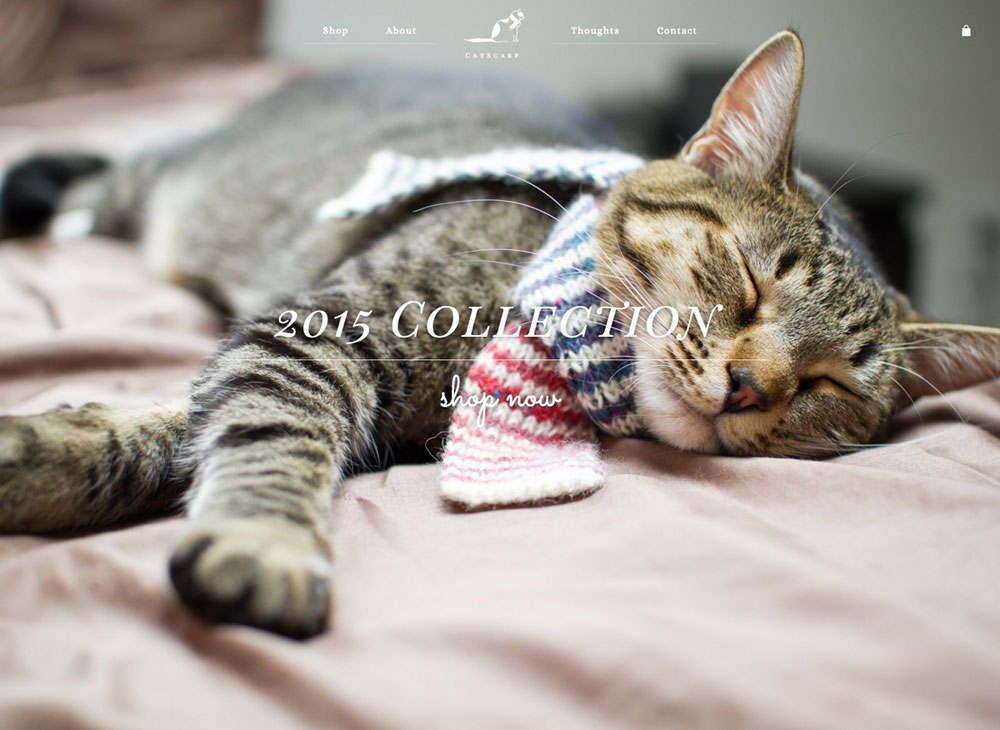
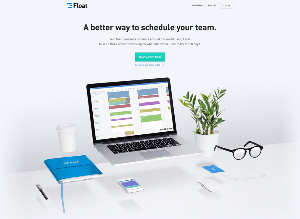
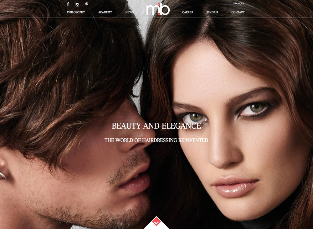
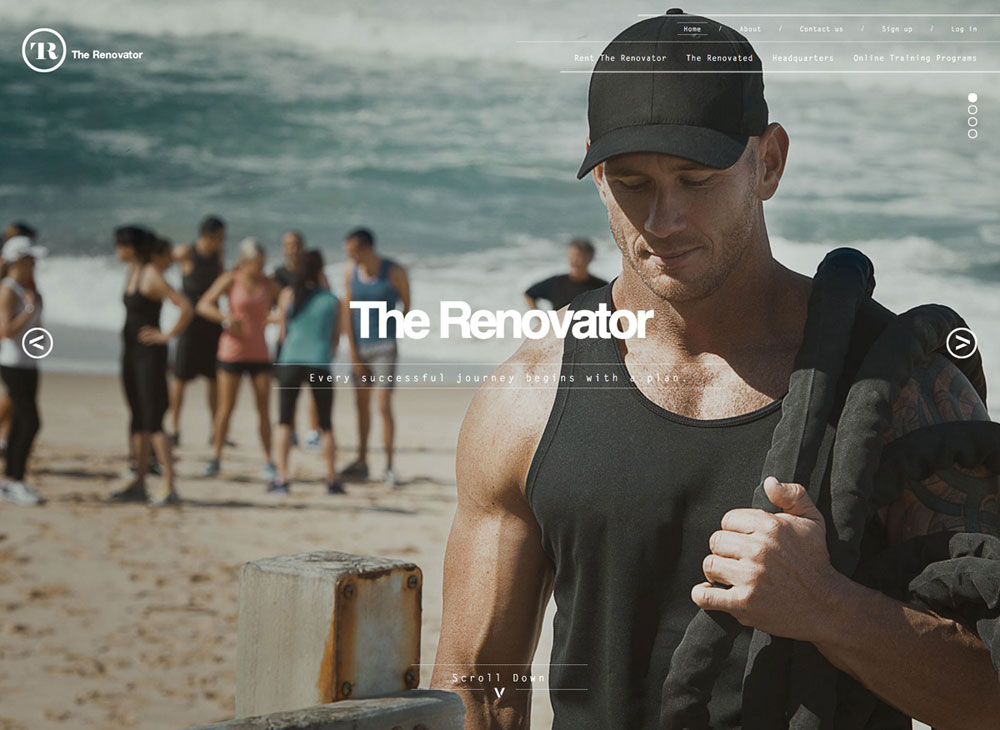
Some examples of hero images and hero banners are:
While some pages may feature an image only, most pages with hero images also contain additional content and text below the image.
Conclusion
So, the next time you think you want a slider on your page, stop and think about if it is really necessary first? To add something to your page just because you can, doesn’t make it a good reason.
- How a Boutique Web Design Agency Offers More Personalized Service - June 23, 2025
- When Should You Redesign Your Website? 7 Warning Signs - June 20, 2025
- We’re Honored: Named One of the Best Web Design Blogs in Florida by FeedSpot - June 10, 2025

