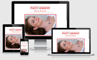
I recently completed a web design project for a client and was very happy with the finished result. That is until the client came back with one final, teensy, weensy request. “Could you please justify the type on my website?” Yikes! Those words stopped me dead in my tracks and made the hair on the back of my neck stand up. Justified type on the web? Why, oh why? The horror!
But, truth be told, I knew why. The client simply thought that justifying the type would make everything look nice, uniform and neat. Had this been a print project, I may have had some agreement on that, but on the web, things don’t work out quite that way.
What is justified text?
Justification, in typography, is the alignment of text within a column so that the left and right margins in a block of text end at the same spot on each line. To achieve this effect, extra space is added between words. This type of justification is commonly seen in printed works such as books and newspapers.
And, it belongs there, since is helps to present a large amount of information in a large area, where neatly aligned columns clearly define the different areas of text on the page. However, print and the web are two entirely different animals when it comes to typography.
Typography on the web and in print is not equal.
When using type for print, the designer has some tricks that can help them control how the user sees the content of their page and many page layout and word processing programs have algorithms built in that help compensate for spacing of letters and words, based on the width of the page.
But, print and the web are two entirely different platforms. In website design you just don’t have that same kind of control over how elements appear on the screen. Surely, you do have a bit of control over some things, but not like you do with print design.

Think about it, just in terms of how visitors view your pages online. One website viewer may be visiting your page from a 32″ widescreen monitor hooked to their desktop computer, another may be visiting it from a 15″ laptop, and yet a third may be viewing it from their tablet or smartphone.
As you can imagine, each of those website viewers is going to be presented with a slightly different version of your site. Obviously, the 32″ widescreen monitor and the smartphone are going to have lines of type that render, wrap, flow and end entirely differently.
So, instead of these beautiful uniform text blocks with justified type, you can end up with huge gaps between words, depending on how the lines wrap. These gaps are often referred to as “rivers” inside the text block because they are large and they are noticeable. Quite the opposite of what my client was looking for, I’m sure.
A computer screen is not paper.
Unlike justifying text on paper – and even that’s not always a great idea – browsers that render HTML and CSS don’t have the features that page layout and word processing programs have baked into them in order to render nicer justified text. These print programs use things like spacing between words, the spacing between letters, wider and narrower versions of fonts, and hyphenation to compensate for gaps when spacing things for print.
When you attempt to justify web fonts, however, instead of nice uniform text blocks, you end up with lines of type that, while justified on the left and right, have those huge gaps within the text block itself.
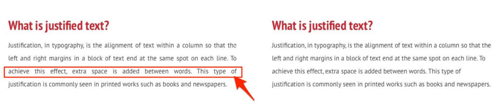
Justified type creating “rivers” (gaps) between words on the line.
Don’t make reading harder for your website visitors.
These gaps make the page hard to read on a digital screen and the words in the line are now interrupted by gaps and no longer flow easily on the eye.
Another problem with justified (even) lines of text is that when the reader’s eye is scanning the lines of type, it makes it much easier for them to find the next line if the lines are of an uneven length.
This is especially true of dyslexic and visually impaired readers who have an even harder time reading justified text. As a matter of fact, the Royal National Institute of Blind people (RNIB) recommends that websites not use justified text in their design.
Many people with visual impairments use screen magnifiers to enlarge the text so they can read it, and this means they also expand those uneven gaps, making it even more difficult for readers to be able to follow the flow of the words and letters on the screen.
Ultimately the purpose of good typography is to communicate words, which requires letters. When the flow of the letters is disrupted, your words and letters are no longer doing their intended job.
Bottom line – when it comes to justified text online, just don’t do it!

- How a Boutique Web Design Agency Offers More Personalized Service - June 23, 2025
- When Should You Redesign Your Website? 7 Warning Signs - June 20, 2025
- We’re Honored: Named One of the Best Web Design Blogs in Florida by FeedSpot - June 10, 2025