Whitespace, which is also called negative space, is the area of padding around elements in your design that are intentionally left blank in a design layout, whether in print or online. And, it is an important design element in and of itself.
And, when I refer to it as “whitespace” I am really talking about negative space. It doesn’t necessarily have to be “white,” but could be the background color of your website, whatever it is. What I am referring to is the empty space between the elements on a page.
As a designer, I look at whitespace as the fundamental building block of good website (or print) design. When it is used correctly it can totally transform a design and increase website visitor engagement.
Often times I will visit websites where the designer or website owner feels they need to take up every last bit of available space on the page for elements and copy. This can leave pages looking cluttered and tiresome for visitors to read.
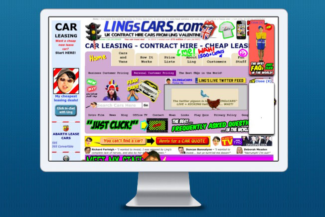
How Not To Design A Page
LingsCars.com has become somewhat of a phenominon on the internet. Reading the site for five minutes can start the onslaught of a screaming headache. But, I can assure you, while this works for their company, because it is their brand, this approach to website design is not going to work for 99.9% of the other websites online. I highly suggest you don’t go down this route!
Keep in mind, you only have about 1/10 of a second for a grab your website visitors and entice them to stay on your web page and interact with it. Whitespace use can be critical here, because no one wants to look at a cluster of images and text and have no idea where to start reading on the page. Whitespace gives your readers eyes “time to breath” and relax, not feel anxious and unsure where to begin.
You only have about 1/10 of a second to grab your website viewers attention and the average visitor will only read less than 30% of the words on any given page.
The average website visitor will only read less than 30% of the words on any given page. So, while you must have concise and engaging text and graphics, it should also be displayed attractively. Whitespace and typography that is used correctly will increase the overall legibility of your web page. And, adding space between paragraphs and lines of content make the page easier to digest.
Benefits of Effective Whitespace Use
Using whitespace allows you to achieve the following for your website:
- Increase content legibility. Your visitors are going to be able to read the pages easier and will be enticed to continue reading.
- Allow you to highlight your calls to action (CTAs). Sometimes people think the best way to make something stand out is to make it larger. But, you can just as easily make something stand out by increasing the whitespace around an element.
- Acts as a separator. Whitespace can be it’s own element in a design, by acting as a separator for graphics and text, improving your visual layout and giving your readers a clear path for navigating your site.
- Create balance on your page. Too little whitespace causes a feeling of disorganization. By the same token, you don’t want to have too much, which may make your page seem bare. Striking a balance is the key.
- Increases visitor interaction. When all of these things are married together on your page, visitors will be less hurried and more apt to slow down and read your website’s pages.
“Less Is More” Concept Is Key
While it might seems advantageous to a website owner to try to throw it all in there on a page, they should always remember the “less is more” concept. This concept has been adopted by many brands to help convey the feeling of sophistication and professionalism of their company. Think Apple, for one. Very clean. Very minimalistic. Lots of whitespace.
Cluttered websites can convey the opposite of this, looking cheap and untrustworthy. They cause frustration and confusion, which leads to visitors exiting your site before they have even had a chance to digest what you have available to them.
To frame it in a different way, imagine if you were shopping in a store that was cluttered and you couldn’t move up and down the aisles freely. You kept bumping into things and other people. It wouldn’t be a very pleasant experience, would it? There is so much going on that all you want to do is leave as quickly as possible. Why would you do that to your website visitors?
Declutter. Focus. Use whitespace wisely and watch your page engagement go up.


- How a Boutique Web Design Agency Offers More Personalized Service - June 23, 2025
- When Should You Redesign Your Website? 7 Warning Signs - June 20, 2025
- We’re Honored: Named One of the Best Web Design Blogs in Florida by FeedSpot - June 10, 2025