Many business make some serious design mistakes on their homepages, some in the name of being “trendy,” that could be causing them to lose potential clients and customers, as well as conversion rates.
Homepage Sliders
I realize that many people think that homepage sliders are “cool and all,” but the bottom line is they rarely convert, and they are a design disaster, more often then not.
Sliders tend to slow visitors down, cause pages to load slower and don’t allow for longer messages. Have you ever tried to read a slider with a long message only to have it cut you off when it changes to the next slide, before you are finished? It can be frustrating, for sure!
According to the Nielsen Norman Group, which did a usability study on the subject, sliders and carousels tend to annoy users and reduce visibility. Here is another article that discusses why sliders fail.
Visitors to home pages are generally looking for information fast. They don’t want to be bogged down with heavy sliders. Make things easier on your website visitors, turn those sliders off. Stick with maybe one strong banner graphic, if you must, in place of a series sliders.
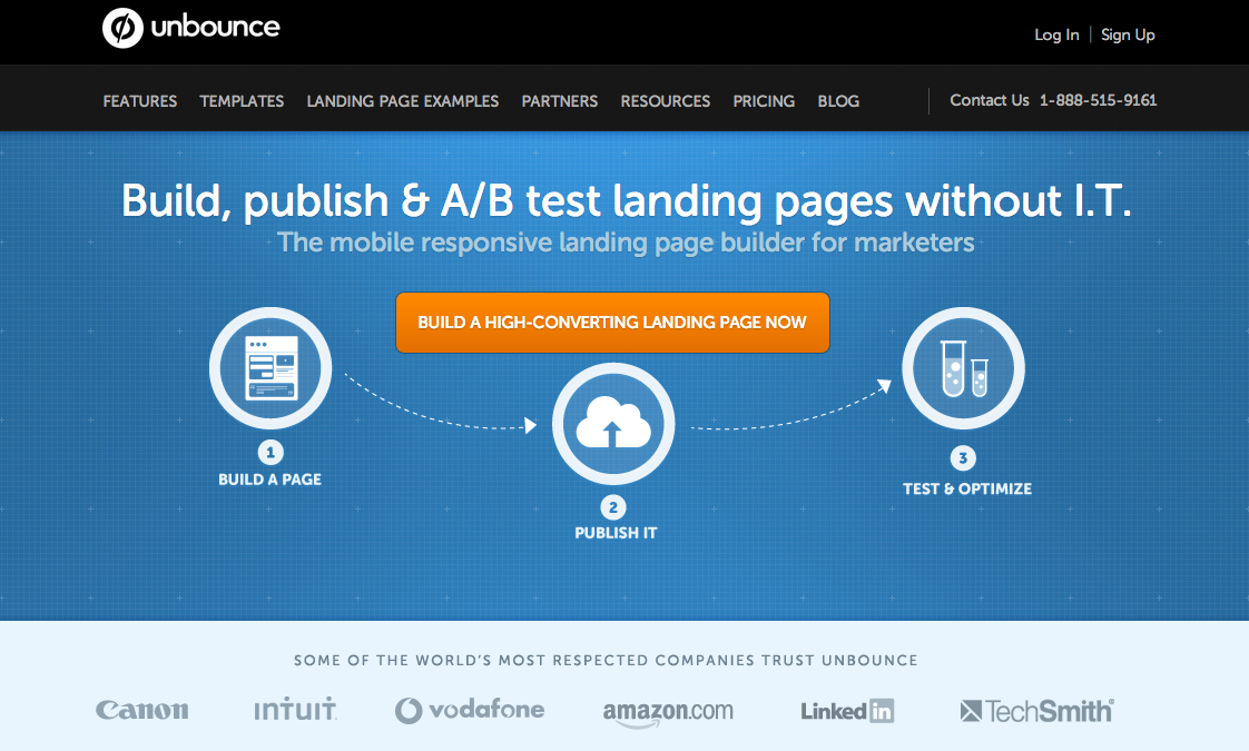
For instance, Unbounce.com uses a strong, but simple, infographic in place of heavy sliders to convey information to their readers.
Kick “Company News” From The Homepage
It’s amazing how many website I run across, or are asked to design, that have “company news” prominently displayed on their home pages. Let me tell you something, NOBODY CARES about your company news!
Maybe your employees do, and possibly investors and your mom, but beyond that the general public really doesn’t give a hoot. Stop giving company news valuable space on your homepage.
You don’t have to drop it entirely, but I would suggest moving it into an interior page, or even better, blogging your latest company awards, employee promotions and such in a “company news” section of your blog.
Make Sure Your Headlines Are About Your Customer, Not About You
I hate to break it to you, but people don’t care about you or your business. They only care about the problem they are trying to solve at the moment they landed on your site, and whether or not you can solve it.
A good homepage headline should be about the problem you can solve for your visitors, not about what you do or the services you provide. Be sure to craft headlines that do more then rattle off a bunch of services, but rather touch on exactly what you can do for your customer.
I read an article recently that talked about the importance of headlines (since the majority of people who visit a site will never get past the headline), and they encourage bloggers and content marketers to spend 50% of their time crafting their article and 50% of their time coming up with a kick ass headline.
Less Is More
Many companies try to cram as much as possible on their homepages, only to have them become too overwhelming for their visitors to even deal with.
Filling your homepage with too many buttons, calls to action, videos or too much text can be devastating on your conversion rate. Your goal is to get people to click through to other pages on your site, so use your homepage for important information and for “teasers” to get them to click into interior pages.
You can read more about some of my simple secrets to good homepage design.
- How a Boutique Web Design Agency Offers More Personalized Service - June 23, 2025
- When Should You Redesign Your Website? 7 Warning Signs - June 20, 2025
- We’re Honored: Named One of the Best Web Design Blogs in Florida by FeedSpot - June 10, 2025


