Something people tend to overlook when designing a logo for their organization or business is the different mediums their logos are likely to be printed on.
Logos aren’t designed for just ink on paper. It’s more than likely that a logo will be utilized in a variety of fashions including office signage, business cards, websites, social media, and advertising specialties, such as pens and other product giveaways.
A lot of times I have clients ask for intricate logo designs with a lot of detail that is reliant on multiple colors. It’s not until I explain to them that their logo must reproduce well at various sizes and in different color spaces, including black and white, that they begin to understand that what they are asking for is very limiting.
Don’t self-limit the use of your logo by over-styling or complicating it.
Steer clear of fine details and intricate patterns in your logo.
Logos that contain these fine details are not necessarily going to look great when shrunk down on a business card, or even worse, an ad specialty item such as a pen or button. All those fine details get lost when reproduced at a small size like that.
According to Smashing Magazine, an online website geared towards graphic design professionals, “When printed in small sizes, a complex design will lose detail and in some cases will look like a smudge or, worse, a mistake. The more detail a logo has, the more information the viewer has to process. A logo should be memorable, and one of the best ways to make it memorable is to keep things simple.”
See what happens when you take a detailed design and shrink it down:
Something people fail to consider when coming up with complex design ideas for their logos is that the best and most memorable logos in the world are simple, not complex. They rely on bold shapes, not fine details.
Think Nike’s “swoosh,” Apple’s apple, McDonalds’ golden arches, and UPS’ shield. These are all simple shapes that are free of intricate and fine details and they can be printed in color or black and white without losing any of the impact of the logo.
Consider using minimal colors in your logo design.
When designing your logo, also keep in mind your color choices. The more colors that are introduced into a logo, the more expensive it will get to reproduce it on certain types of items.
For instance, while you may have no problem printing a logo with 12 different colors from your in-house inkjet printer, when you try to reproduce that on something that will be silk screened, such as a t-shirt, the costs go sky high because of all the colors involved. And having letterhead, envelopes and business cards printed turns into a full-color job, as opposed to a spot color job, which can be much less expensive at a commercial print shop.
The other pitfall to multiple colors is if your logo design relies on color for its effect you will lose your impact when it is printed in black and white – and there will be instances where you must print it in a single color, believe me.
As a logo designer, I actually create logos in black and white FIRST and then introduce color from there. You should consider doing the same.
Create multiple versions of your logo.
Many successful brands will have several versions of their logo design. Usually, secondary logos are created building off the primary logo, in order to keep their branding consistent. And, they also create multiple color versions for reproduction in color, black and white, and grayscale.
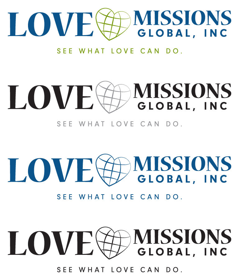
For instance, this recent logo design concept I created for a non-profit organization works equally well in several color spaces – two color, grayscale, with subtle gray shading for a two-tone effect, single color, and black and white.
But, I also took into consideration that they may need to print this in an area that is not necessarily horizontal, but rather vertical or square, so I also created an alternate version of the logo for them. Here is an example of that version embroidered onto a hat.
As you can see, the heart has been moved to take the place of the “O” in “LOVE” in the secondary logo, to allow for use in areas that are more vertical or square, rather than horizontal.
Watch your logo design font choices.
Choosing the right font is actually on of the most important parts of logo design. A logo can actually fall flat if the wrong font is used in it.
Be careful to match the style of the font to the company, your brand, and the icon in your logo, if you are using one in your design.
Also, be mindful of how an overly “fussy” font will reproduce at various sizes and test it at different scaled sizes before committing to it.
And, please, I can’t stress this enough, use a maximum of two fonts of different weights in your logo design. Mixing too many fonts causes confusion and detracts from your logo.
Design your logo in vector-based formats.
Logos should always be created in a vector-based format, using a drawing program such as Adobe Illustrator or CorelDraw.
Having your logo in a vector format give you the best quality when it needs to be scaled up or down for various uses.
A lot of people attempt to design their logos in Photoshop or Paint, or even worse, Microsoft Word. These programs do not produce the proper format for your logos when you need to supply it to a vendor to use in various types of printing, silk screening, or embroidery.
When a professional graphic designer creates a logo for you, they will provide you with various versions of your logo, including an EPS (vector-based) file, which is the best file type to have in terms of reproduction for various uses.
Remember, your logo must be “multi-purpose.”
Your logo will become part of your branding and will be used in a variety of fashions, keep this in mind when you are designing it.
Make sure that it is multi-purpose from the start, so you don’t run into issues or problems later on down the road.
You may also want to read my article about the five elements of effective logo design for more logo design tips.
- How a Boutique Web Design Agency Offers More Personalized Service - June 23, 2025
- When Should You Redesign Your Website? 7 Warning Signs - June 20, 2025
- We’re Honored: Named One of the Best Web Design Blogs in Florida by FeedSpot - June 10, 2025

