Even though we have ventured into a more digital age for advertising mediums, logo design still couldn’t be any less important than it was when we used primarily print design for marketing. Logos are what makes a company or organization easily identifiable.
Too often people will attempt to create their logo only to find out they have a hot mess on their hands. They soon discover that their carefully crafted creation doesn’t work well in black and white, or looks terrible when they shrink it down for a business card or enlarge it for a poster.
Paul Rand, one of the most prolific graphic designers in the industry, who has created logos for Westinghouse, UPS, ABC, and IBM, among others, said about logos: “If, in the business of communications, ‘image is king,’ the essence of this image, the logo, is the jewel in its crown.”
A good logo should encompass the five elements of good logo design that have been standard in the graphic design industry for years.
1. Keep it simple.
People are bombarded with images all day long, especially with the 24/7 always connected lives that we live in now. Your logo should stand out in the sea of eyeball chatter.
Logos that are complicated or fussy are not easy for people to digest in just a few seconds. If a logo has a lot of type to read or a lot of elements to digest, you will lose people very quickly. Simplicity wins every time.
Think about logos like Apple and Samsung. They are about as simple as they come, yet they are easily recognizable, which brings us to the next element.
![]()
2. Make it memorable.
Memorability goes hand in hand with simplicity. If someone has to look at your logo for longer than 3 seconds to figure out what it is, you have missed your mark.
Your logo should be memorable at just a glance, because typically that is about as much time as you are going to get from most people.
I heard it once said by an advertising pro that if someone can’t recognize your logo driving past it at 70 miles per hour, it’s a failure.
Consider Nike’s logo. It’s a simple swoosh and people know what it is and remember it with ease.
![]()
3. Make it timeless.
Good logos should stand the test of time. If your logo is only following trends, such as using the latest trendy font or style, it can become outdated in just a few years.
Then you may find yourself in a situation where you have to do a total rehaul on your logo and branding so that your whole company doesn’t look dated. Redesigns are expensive and time-consuming.
Create a logo that will last or that can stand on its own with very little changes over time. UPS, Burger King, and Starbucks have all updated their logos over the years, however, the core logo concept still remains with each iteration of updates, so their logos continue to be recognizable.
Also, think of Coca-Cola’s logo. It has been around for over a century and is still appealing to consumers.
![]()
4. Make it versatile.
Your logo needs to be versatile enough that it stands on its own no matter what the presentation is. It should look good whether you are printing it on paper, using it on a website, printing it on t-shirts, hats, or banners.
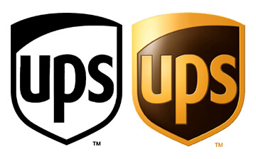
It should look good in full color, single color, black and white, or grayscale. If your logo is entirely reliant on color and you run into a situation where it must be printed in black and white, it has lost its effectiveness. Consider the UPS logo below. It works well in both black and white and in color.
If the logo has lettering and an image they should be able to work independently of each other and still be recognizable to your brand.
A good logo should be able to be adjusted to various sizes and dimensions. It should be legible whether it is scaled down to the size of a keychain or pen, or all the way up to a billboard. Can you imagine a very detailed or ornate logo being printed on a pen? It wouldn’t be recognizable at all.
![]()
A well-designed logo should lend itself well to adaptability from a horizontal orientation to a vertical orientation while still maintaining its intended look and feel.
5. Keep it appropriate.
Your logo should take your audience into account, not just what your personal tastes happen to be at the time. Keep your business or organization’s core operations in mind.
A good logo design takes into account your brand’s story and the audience it must appeal to. Just because you like fuschia pink and yellow doesn’t mean those colors would appeal to your target audience.
Bonus: Create your logo in a vector-based graphics program.
This isn’t really a design principle, but rather a warning/rant from me. Please, please, please – whatever you do – create your logo in a vector-based format. I can’t stress this enough. Vector-based artwork is created using points, rather than pixels, which means your logo will be infinitely scaleable in size, without losing quality. Programs such as Adobe Illustrator and Corel Draw are vector-based graphic programs.
Working a vector format also allows you to apply various spot colors easily, and move around elements in your logo design, so they can be used in applications such as t-shirt printing and embroidery.
So many people will try to create their own logo in a paint program, like Photoshop or Paint, because it’s what they have, or it’s what they know how to use. Even worse, they will throw together clip art and type in Microsoft Word and call it a logo. This is not how you design a logo!
One, using commercial clip art, without some heavy modifications, as the main element of your logo is wrong on so many levels. Not only is the logo going to be unoriginal, but you could very well be breaking copyright law by doing so.
Many royalty free image sites have specifications in their terms of use that say that their clipart cannot be used as a logo. This stems from the fact that your logo could never be trademarked since you don’t own the original copyright to a recognizable piece of artwork that is in it.
And, two, working in a pixel-based program like this limits your ability to not only scale your logos for various uses but also to pull colors out of logos to be able to use them in black and white printing.
Conclusion
Following the best design principles make the foundation of some of the most memorable logos out there. If you have a logo, take a look at it and make sure it passes these tests above. If you are designing a new logo, do so with these elements in mind. If you need help with designing a logo, contact us about our logo design services.
Do you have a favorite logo or one that you hate? Feel free to discuss why you like or hate one below.


- How a Boutique Web Design Agency Offers More Personalized Service - June 23, 2025
- When Should You Redesign Your Website? 7 Warning Signs - June 20, 2025
- We’re Honored: Named One of the Best Web Design Blogs in Florida by FeedSpot - June 10, 2025