A lot of people find reading a company’s annual report about the most boring thing they could do in the world. But, an annual report doesn’t have to be boring and bland. With the right design and delivery, it can be engaging for your readers.
And, a lot of graphic designers find designing annual reports boring. But, I guess you just have to find the right designer for the job. They happen to be one of my favorite types or materials to design, whether printed or in digital format. Actually, I tend to prefer longer documents like annual reports, newsletters, etc. to quicker things like flyers and postcards.
If you design an annual report well, and present it in the right format, it can be a great vehicle for presenting your company’s milestones from the previous year and highlighting what your company’s mission and vision is for the future.
Uses For Annual Reports
Annual reports are used by companies for a variety of reason, the most prevalent being to disseminate information to their investors and stakeholders. They help encourage investors to purchase stock, help others to understand a position, encourage customers to purchase products, give employees a common goal to unite them, and help create a positive impression with opinion leaders.
But, delivering a strong message requires compelling design and production. Your report must have solid content, be organized and be more than just a vehicle for spewing information out. It must be persuasive, and maybe even cutting-edge.
Trends in Annual Reports
Interestingly enough, one of the trends in annual reports that continues to rise is to create two versions – one for print and one for online.
According to a survey done in 2013 by the National Investor Relations Institute (NIRI), seven percent of companies use only a printed format for their annual reports, five percent use an online format, and the rest used a combination of both print and online.
It showed that only 7% of companies were still only presenting their annual reports in a printed format only. That means everyone else was either doing a digital format, or a combination of digital and print.
These numbers are gleaned from some facts found in the report:
- Electronic/Online annual report budgets increased 30% over 2010
- Online tracking of reports increased 60% between 2008 & 2012
- 80% of those that track do so to improve the next year’s budget
- Of those producing a sustainability report, 18% chose an online format
Why An Online Annual Report
Traditionally, when a printed annual report is sent, that’s pretty much the end of it’s content life. However, when produced as an online report, it can be used in a number of ways, such as on other pages of a website, emails, blog posts, videos, etc. It’s just a matter of thinking of ways your annual report content would be relevant to share with your audience.
Creating an online version makes it easier for your company to share and reuse the information. Plus, it gives your site extra content for search engines to find.
An online version of your annual report can come in several formats. You can serve it up as an extension of your main website, create it as a mini-site or simply put up a PDF of your report to be read online or downloaded. Yes, search engines do read PDF’s too!
Some companies are even forgoing actually printing their annual reports and choosing to disseminate them entirely online instead. Some of the benefits they find in doing so are:
- Cuts out the expensive printing process
- Conserves natural resources
- Measurable (tracking and analytics can be attached to an online version)
- Offers more visibility
- Easier to reach a broader audience
- Encourages interaction and engagement
The Salvation Army
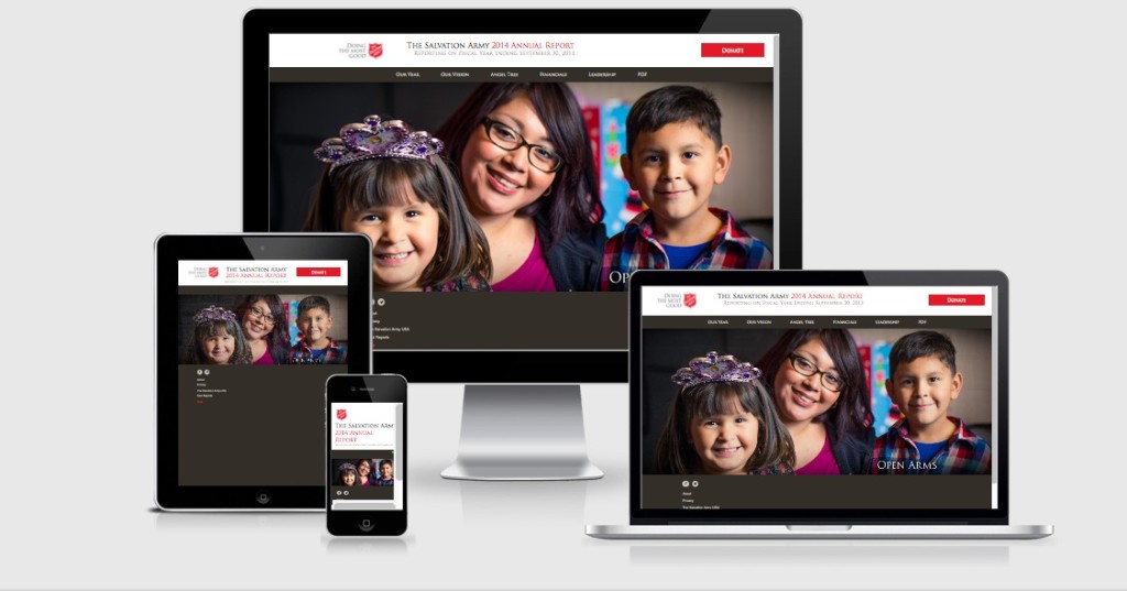
For instance, The Salvation Army no longer produces a hard-copy of it’s annual report. Instead it uses a digital version which includes a message from the organization’s leader and stories from people that they have helped.
They produce a fully interactive website, specifically for their current year’s annual report, that includes an area where you can download the report in PDF format, and it also allows you to retrieve previous year’s annual reports. A prominent red “donate” button also encourages visitors to make a donation to their organization.
Not only is the Salvation Army saving funds by not producing a printed piece, their annual report is now interactive and actually encourages readers to donate funds!
Shopify
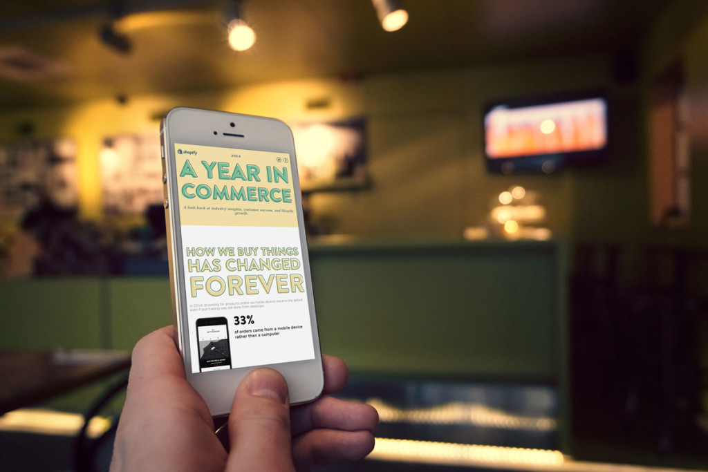
Shopify produced their 2014 Annual Report as a one page scrolling site. It looks back at their industry, shows Shopify growth and customer successes. Focusing heavily on the fact that 1/3 of ecommerce orders are coming from mobile devices, instead of computers, it created an Annual Report that reflects that trend.
Their annual report is a scrolling one page site that is designed to be mobile-friendly and responsive. Studies have shown that visitors prefer to scroll when viewing on mobile devices, instead of having to click from page to page.
Elements Of An Exceptional Online Annual Report
When considering an online annual report, some of the key things a company should keep in mind as they move forward in the planning of the next year’s annual report are:
The power of visuals and infographics.
Reading a printed annual report can be tough, because of the volume of information that is in them and the huge amounts of text. Trying to read all of that online would make the job even more uninviting. You need to leverage to power of charts and infographics to show, not tell, your story. Lots of data can be presented in a concise fashion in a properly prepared infographic.
Use the power of online-only capabilities.
Creating an online report gives you the ability to make it interactive, unlike a traditional paper format. Use multimedia videos, sound bites, parallax scrolling, animations and other forms of interactive content to liven up the reading experience.
Summarize the information.
Many people are likely to review a company’s annual report – stockholders, consumers and employees, among others. Certain facts in the report may only be interesting to a certain group of readers. Use headings and links to summarize the different types of content to make it easy for readers to find the information they are interested in.
Use clean and flat design.
A minimalist approach to a well-designed annual report is becoming industry standard, whether you choose print, online or both. Don’t put in tons of bells and whistles, just because you can. Simple, glanceable call-outs summarizing your key points, minimalist assets and flat, two-tone design will make your annual report more effective.
Allow for offline annual report access.
Understand that not everyone is ready to adopt an all online access world. Consider producing both an online version (in the form of a website) and a PDF version (even if you aren’t going to actually go to the cost of printing). This allows the reader to choose to download the PDF version, if they like, for offline printing and reading at their leisure.
View My Webinar on Online Annual Report Design
- How a Boutique Web Design Agency Offers More Personalized Service - June 23, 2025
- When Should You Redesign Your Website? 7 Warning Signs - June 20, 2025
- We’re Honored: Named One of the Best Web Design Blogs in Florida by FeedSpot - June 10, 2025


