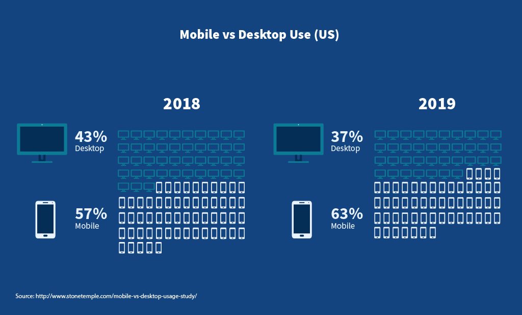
In case you have been living under a rock, mobile devices have taken over the way people use the internet, and this is expected to continue for quite a while.
Right now, about 52% of web surfing happens on mobile phones. This means the internet is being accessed by more pocket size devices then desktops! This upwards trend for smartphone use to get online is expected to grow by at least 6% in 2019 and will continue to be an up-swing moving forward.
This makes having a mobile-friendly and responsive website design so important right now.
Is your website responsive and mobile friendly?
Yet, amazingly, I still run across a large percentage of websites that are not mobile-friendly or responsive on smartphones or tablets. This means that more and more visitors to those sites are having very poor user experiences on them, which in turn could be leaving them with a less then positive feeling about the company they were interested in doing business with.
If you haven’t checked your website recently to see what the mobile experience is like on it, now is the time to do so. Check for things like how difficult the text is to read on the screen, how much horizontal scrolling (side to side) or finger zooming you need to do to view the entire site (you shouldn’t have to do any!), and how easy your menus are to navigate on mobile.
52% of all internet users are visiting your website through mobile devices. It’s important that it is ready to accommodate that type of visitor.
Some best mobile design practices include:
- Keep your calls to action front and center and viewable directly on page load on a mobile device.
- Keep your menus show and sweet. Mobile users don’t have the patience to have to scroll through long menus.
- Make the home page easy to get back to. Most users expect to be able to tap on your logo in the top left of their device to get back to home.
- Choose not to use interstitials, or those annoying pop-ups as many call them. These annoy mobile users and they often don’t work correctly on smaller devices. If you must use them on the desktop version of your site, be sure to disable these on mobile views.
- Don’t use Flash technology on your site. EVER. Flash fell out of favor a long time ago, mainly because it’s terrible to SEO. But, in case you weren’t aware, most smartphones don’t even support Flash, so mobile visitors can’t even view pages that have them correctly.
- Make sure your buttons are large enough to work on mobile. Clicking a button with your finger is a bit differently then using a mouse. Bigger buttons help.
- Use legible (i.e. larger) font sizes, as well as more standard fonts. Reading text on a tiny screen is hard with small font sizes, and ornate or non-traditional fonts can also be much more difficult to read at smaller sizes.
- Test…test…test, and then test again, on mobile. Don’t forget that whenever you make a change to your website, you must check it on mobile as well as desktops to see how it performs.
Have you checked your website on mobile lately? How does it look? Feel free to comment below and let us know.
Image and stats compliments of WizCase.
- How a Boutique Web Design Agency Offers More Personalized Service - June 23, 2025
- When Should You Redesign Your Website? 7 Warning Signs - June 20, 2025
- We’re Honored: Named One of the Best Web Design Blogs in Florida by FeedSpot - June 10, 2025


