Your website is the core of your digital marketing campaign and contributes significantly to your online revenues. During any typical web project, there is so much involved – design, content, navigation and technical considerations like speed, hosting, SEO and so on. So how do you navigate through all of these aspects and come up with a powerfully impactful website? We recommend working with a professional web design and development company simply because many business owners fail to understand the prerequisites of a good website and end up making so many mistakes.
We’ll take a look at these in this article so that you know what to avoid during your web project. Of course, the best solution to prevent website design mistakes is simple: work with professional developers and your conversion rates and sales can increase multifold, literally!
1.) Not Optimized for Mobile
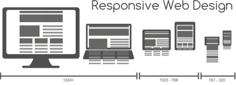
Even when business owners know that more than 50% of internet traffic is through smartphones, they simply don’t optimize their websites for the platform. Gone are the days when multiple versions were required for a site to be compatible with mobile operating systems. Today, all you need is a responsive design approach to ensure that your website is compatible with mobile devices. Responsive web design is an approach for building web pages that are altered through CSS3 queries. The HTML code of all these pages is the same, but the presentation changes automatically when accessed on a mobile platform.
No, there is no hard-core programming involved here. Just choose a responsive theme, and that is it. So now even your mobile visitors will enjoy viewing your website on their devices without constantly having to zoom in or scroll to the right.
By the way, Google also supports two other configurations when catering to mobile devices — a website that serves every device using the same URL set, but where each URL is linked to different HTML codes and CSS queries for desktop and mobile platforms. The second configuration is to have a separate website, but of course, this is just double work. So responsive design is what any good website design and development company would suggest.
2.) Not Having a Favicon
Not having a favicon is one of the most common website design mistakes made by small business owners. Generally, visitors prefer using tabs when they browse and often leave several of them open at the same time. While it may seem like such a little thing, with little important, it’s really not. If you have a favicon, users can locate your website quickly among the already opened tabs. Since this increases their convenience, they would also prefer your company more over others.
Favicons can quickly be generated through online tools. Input your logo, and shortly, you’ll be provided with a link to download the favicon. Place this in the root directory of your website. The name of the link should be favicon.ico.
3.) Generic 404 Error Pages
404 error pages reduce website traffic, regardless of how good the design or content is. A survey took responses from 3,475 users and concluded that the majority of them don’t even bother resolving the issue, and instead, just choose another company or brand.
404 is the standard response generated by HTML that informs visitors that they have clicked on a broken link. When designing websites, you do require these pages. But by standard, they have a generic format. However, you do have the option of using them creatively and add more value to your website. Add a tint of humor, a beautiful design or something that ascertains a positive user experience so that your visitors are less annoyed.
Professional web developers often suggest customizing 404 pages, branding the design with your company’s logo, colors and the like. Android, Slack and 20th Century Fox have setup intuitive 404 error pages that are definitely worth checking out. And CarWow has created a cute 404 page that acts as an interactive 2D car game to test visitors driving skills. There are all kinds of unique and different ways you can use a custom 404 error page.
4.) Using Carousels on the Home Page
Carousels are those big images that greet you when you land on a page and then begin cycling through, often with messages on top of the image. While they were once in fashion, they are no longer being utilized as much, which is a good thing. Issues arise when it comes to automatic scrolling because this reduces visibility, thus decreasing conversion rates. Studies have shown that most people don’t get past the first image in such a carousel. Known to induce banner blindness, carousels distract and frustrate visitors, forcing them to abandon the page. These type of carousels, or home page sliders, as they are often referred to, were all the rage in past years, but since then have been replaced by a much more sensible hero image with a strong call to action message on it.
5.) Slow Speeds

Google suggests that 3 seconds is the acceptable time for a page to load, and for 70% of the websites, loading time is around 7 seconds. Talk to your website design and development company, and they’ll guide you more about speedy websites and quick loading times.
Having a speedy website is essential, not only for positive user experience but also because it impacts your rankings; you definitely won’t want to fall down on the pages further. Let’s quickly take a look at metrics, which Google utilizes for accessing page speed.
- Time to the first byte (TTFB) — Time to the first byte, or first byte, measures the time elapsed from the beginning of the navigation till the first byte of the page is received. Upon entering the URL in the address tab, the browser requests the HTML document on that URL. Obviously, a quick response from the server means that the page will load faster.
- Start to render — Represents the time it takes for the first non-white content to appear after the starting navigation. During this time, visitors know that the browser is working to display the page.
- Document Complete — By definition, document complete is the point when all static page content has been loaded. The web page may appear to have been fully loaded, but there may be additional workings in the background. The page loading speed cannot be measured until these are completed.
- Fully Loaded — Fully Loaded time represents the time from the start of the navigation till two minutes after Document Complete, including asynchronous content loading and other activities carried out by the JavaScript after the main content and design have loaded. Since this doesn’t prevent users from viewing the page, it’s not counted towards the page’s loading time.
- File Requests — When a page has loaded, the browser has to display CSS, JavaScript and image files. The number of these requests and file sizes affect loading speed.
6.) Having a Slow Server Response Time
Great, you may have optimized your website speed by now, but if your server response time is slow, the website will still be slow even if it is optimized. Google suggests that an ideal server response time is less than 200 ms, but many times, it can be more than this because of a number of reasons, such as frameworks and libraries, slow application logic, memory starvation and database queries. Here are some of the best ways to improve server response time.
- Evaluate your hosting plan and provider — Is your plan sufficient and is your hosting provider reputed? Your resources must be sufficient enough to handle more than your average website traffic at any given instance. Keep in mind that when you are choosing a lower-cost hosting plan, you are most likely on a “shared server,” which means you are sharing the server resources with hundreds, or even thousands of other websites, any of which could use excessive resources that would impact the speed of your site.
- Select a server carefully — Apache is a good option, but sometimes, other servers may be a better choice. Compare different servers and choose the best ones of them based on the advice of your web design and development company.
- Optimize servers — Sticking to default settings is an easy way out. The needs of every website are different, so review the settings for your particular case and make sure they are optimized for your usage patterns and web traffic.
- Reduce bloat — Bloat can accumulate with a content management system. Upload images only after optimization and compression, combine resources and take other necessary steps to reduce bloat.
7.) Rejecting Design Norms
Certain website designs are considered to be de facto. While you do have flexibility, if users expect a certain thing, ensure that they get it. For instance, your website must have a search function and navigation bar at either the top of the page or on the left-hand side. While not every site will have the same structure, most users also expect a logo which when clicked takes them back to the home page, as well as a footer containing additional links that might not be in the main menu. When designing, there is a lot of room to be creative, but follow the accepted norms as well.
8.) Unclear or Inconsistent Typography
Style and size
Typography impacts website design. While you can choose any font that you like, opt for something that is legible. Generally, handwritten and cursive font styles are often hard to read, so avoid using them.
The fonts that you choose must be clear, visible and easy on the eye. While you can change the site depending on where the text is placed on the page, do ensure consistency in terms of style.
Kerning
Poor kerning, tracking and leading are also common font-related website design mistakes. Kerning is the space between characters; leading is the space between two lines, and tracking is the space between two words. Ascertain that all these spaces are appropriate. Avoid fully justified text on a website, as it severely impacts the tracking in a paragraph and makes the typography on-screen more difficult to read.
Too Many Fonts
Avoid using too many fonts on a page because it creates confusion, distracting your visitors, and looks unprofessional.
9.) Having Too Many Unnecessary Pages
If your website isn’t an eCommerce store, you don’t need more than 5 pages, at most. Keep pages to a minimum so as to simplify navigation and website structure. Determine the appropriate number of pages by answering the following questions:
- What do you do? (Core expertise and benefits)
- How can you help? (Approach, methodology, and procedure)
- Whom can you help? (Targeted industries)
- How can you help? (A description of your offered products and services)
- Why do you help? (Your vision, mission, and values; the About Us page)
10.) Too Many Colors
How many colors are there in your logo? 95% of the brands only use two colors at most. Of the shades preferred, blue and red are the most common, utilized by 33% and 29% of the brands, respectively.
Your website should have the same colors so that it resonates with the rest of your brand. Generally, your logo colors should be the primary shades in your website design. Use two or three complementary secondary colors, if required. But avoid using too many of them. Colors convey authority, power, warmth, friendliness and other emotions, so they must be chosen properly. Common color mistakes include:
- Using pure black — Black isn’t a natural color. When viewing on a computer screen, it can overpower adjacent colors, so avoid using pure black color with the hex code #000000. However, you can use dark shades of grey, which appear just like black. If they seem too dull, you can add a bit of blue.
- Putting red and green next to each other — Red and green shouldn’t be used right next to each other for a number of reasons. For starters, these colors are close to each other on the spectrum of visible light. When placed together, they increase brightness as each shade tries to get the foreground. Also, some people are color blind, and will not be able to distinguish between these colors. And by the way, red and green together also result in conflicting emotional responses, implying that visitors may not take the action you desire.
- Avoid yellow and purple if the background is green — Are you a green company? Many environmental-friendly businesses often use green — that is fine. But if you’re using this shade as the primary color or for the background, avoid using purple and yellow then. Purple on green or yellow on green increases intensity and makes it harder to read the screen.
- If the background is white — Use bright colors for the text so that users don’t face any readability issues. Colors like blue, dark green and dark grey stand out on a white background.
So were you making any of these website design mistakes? Work with a reputed web development and design company, and avoid all of them. Feel free to give us a shout if you are in the market to move beyond a DIY site and really start unleashing the power of online marketing.
- A Step-By-Step Guide to Designing a Mobile-Friendly Website - November 11, 2024
- How Content Marketing Enhances Your Website’s SEO Performance - November 11, 2024
- How to Pick the Perfect Color Scheme for Your Website Design - November 11, 2024


