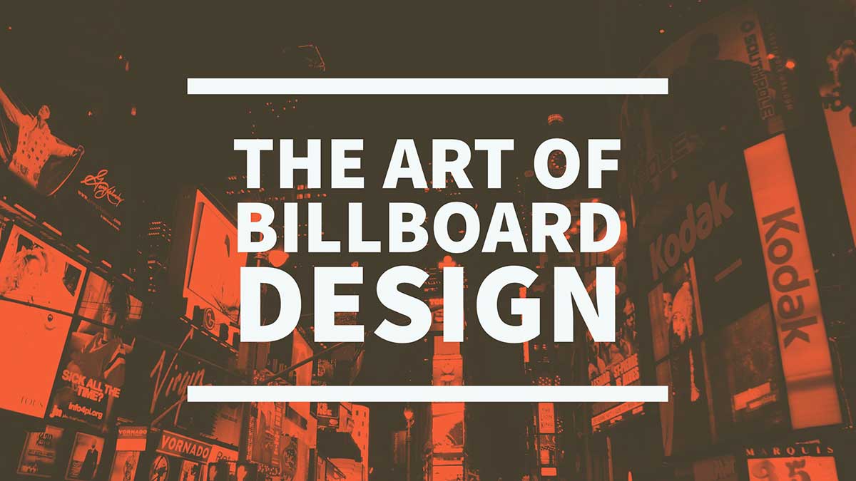
Billboard design is a whole different type of design specialty in and of itself. Whether the billboard is on the side of a building, on a sign on the side of a highway, or on the gas pump at your local gas station, it’s not the same as advertising pieces that are printed on paper and handed to someone.
Unlike traditional advertising design, let’s say for instance a brochure or sales sheet, where the user gets to hold an actual product in their hands; with billboard design they generally only get to see if from afar, and usually while traveling by it at 60 MPH or more.
Viewers of your billboard only have about 2 to 5 seconds to take in your company name, read a witty tagline you have come up with, or take in any visually appealing branding you have.
Adding more information to your billboard doesn’t get you better results or make it more attractive. Often it can make it more distracting, and the viewer doesn’t take away anything at all from it then!
When designing a billboard, there are some tenets of billboard design that you need to remember, whether you are handling it yourself or hiring a billboard designer to tackle the work for you.
1.) Keep the board to 3 main elements.
Your billboard design will be greatly enhanced if you keep it to just an eye-catching headline, a great image, and a simple call to action, such as including your website URL or a phone number.
2.) Use just 1 call to action.
Posting too many calls to action, such as a phone number, address, and a website will make the billboard too cluttered. Pick whichever one you feel is most important and use that. Don’t forget, in this day and age, most people are carrying around smartphones, and if they want directions, they can easily find them there.
3.) Try to use 7 words or less.
Try to keep the amount of text on your billboard, including your headline and call to action, at around seven words or less, if possible. Remember, your viewer doesn’t have a whole lot of time to view and interpret your message. Don’t make it any harder to comprehend then you have to.
4.) Use wide, bold, and big fonts.
A bold and wide typeface will be more easily viewed than a thin and narrow one at high rates of speed. Large fonts allow for reading at greater distances, giving your viewer time to process your message. If it works with your brand – and even if it doesn’t – for this medium try to consider these type of fonts when designing your billboard.
5.) Use easy to read fonts.
When it comes to typestyles on billboards, stay away from fussy or ornate fonts. Use fonts that are easy on the eyes and instantly recognizable. Elaborate script fonts are very hard to read at long distances, and fonts that combine both thin and thick strokes can be difficult for the eye/brain to take in all at once. Avoid ALL CAPS, as they are less legible too.
6.) Use contrasting colors.
High color contrast is a must for easy to read messages. Colors such as black and white and primary colors such as red, yellow, and blue read well. The highest rates of readability can be found with black text on a yellow background. Earthy tones, pastels, and browns have a much lower ease of readability.
7.) Take the design for a test drive.
Print your billboard design out at the largest your printer can handle. Show the mockup to someone who has not seen it before (preferably), from about 20-25 feet away, and ask them to walk briskly and directory towards it. Allow them to look at it for only 5-10 seconds, as they are walking towards it. Are they able to read the whole thing? Do they understand the message and concept? Did they get your call to action? This simple simulation to a drive-by viewing will help you determine if your design hits the mark or not.
Conclusion
There is an “art” to excellent billboard design, and it’s important that best practices be followed when creating a billboard. Billboard advertising is not a cheap way to go, so make sure that you are maximizing your dollars by getting the design right on it from the start.
If you need help with designing your billboard, please feel free to give us a call or drop me a line using the contact form. I would be happy to speak with you about it.
Have you designed a billboard on your own before? Feel free to share your experiences below.
- How a Boutique Web Design Agency Offers More Personalized Service - June 23, 2025
- When Should You Redesign Your Website? 7 Warning Signs - June 20, 2025
- We’re Honored: Named One of the Best Web Design Blogs in Florida by FeedSpot - June 10, 2025


