Whether you are launching a new brand or rebranding, logos are a very important part of that. They are what potential customers first see about your company. Logos affect your customers’ perception of your brand and purchasing decisions.
So how can you come up with an outstanding logo? Follow our golden rules of logo design!
Be Unique
Your logo distinguishes your brand from the competition, so the images you choose must be different and stand out. In the online world, it can be hard to be unique, but that is what good graphic designers do. Work with them, and they’ll help you come up with a logo that resonates your brand and personality, impressing and appealing your target audience.
Understand Your Brand
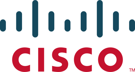
An effective logo design is based on your brand. Your logo introduces your brand to potential customers and must be something that should remind you of them. If possible, your logo should also communicate your basic business goals somehow. For instance, the Amazon logo clearly signifies that everything from A to Z is available at their store. Similarly, the Cisco logo features blue stripes above the company’s name, representing an electromagnet as well as the Golden Gate Bridge — a landmark in San Francisco where the company is headquartered.
 |
 |
Select a Style
Logos can broadly be classified into the following styles. Pick the most suitable one of these for your brand.
Classic Logo Design
Neon colored logos are in these days, but you know what the problem is? Let this year-end, and they may very well become outdated. Same is the case with bubbly fonts. These “trendy” type of logos come and go. And, while they do look impressive, they may not be a great choice if you’re thinking long term.
Classic logos are modest but are often much better at standing the test of time. Create them by following the golden rules of logo design, and you will make an impact. These logos are preferred simply because they always remain “fashionable” and help you reach out to a bigger audience for a longer period of time.
Retro or Vintage Logo Design
Retro logos are relatively new and are often chosen if you want to remind your target audience of the past. These logos often reflect originality and uniqueness.
Modern and Minimalist Logo Design
Newer brands select clean and minimal logos, representing their modernity. These designs don’t have any details, often include lines and simple shapes and utilize the whitespace. Such logos reflect that your brand is up to date and stays on top of design trends.
Fun and Quirky Logo Design
Is your company marketing to kids and teenagers? The use of cute and quirky symbols for your logo can reflect youth and fun. A big word of warning, however, if your brand isn’t targeting this demographic, never use this type of logo design for it! It just won’t send the right message to your target audience.
Handmade Logo Design
Just as the name implies, these logos signify that your products are made from hand and have an individuality of their own.
Select the Right Type
Logos fall under different design types. You can either choose one of these types or combine multiple types for a unique look.
- Lettermarks – These logos are a good choice if your company name is too long; just stick to the initials then, like HP and CNN.
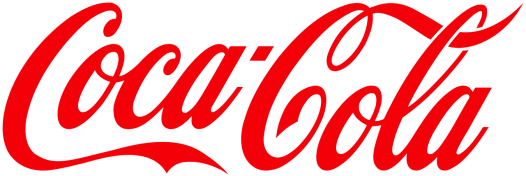
- Wordmarks – Is your brand name simple? Individualize it, focus on the typography and use as your logo. Common examples are Coca Cola, FedEx, and Google.
- Pictorial Marks – These are iconographic images that are simple and easy to remember
- Abstract Marks – These logos don’t strike an immediate connection but are linked to your brand.
Use Double Visuals
A double visual is actually a logo that combines two different images into a single picture. This is an effective logo design because it is unique and a clever way of conveying a concept or an idea.
Play with Color
One tip for effective logo design is to ensure that you don’t use any shade that your competitors are already using. So before choosing a color for your logo, check out the colors in their logos. Now go with a different color so that your brand can stand out among the masses – after all, the basic purpose of all golden rules of logo design encompasses differentiation, uniqueness, and appeal.
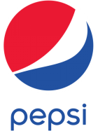
Evaluate the typography as well when reviewing logos of other companies. Just like color, effective logo design also implies that you use a completely different font and style. Consider Pepsi and Coca Cola, for instance, the two biggest brands in the beverage industry. Pepsi is blue and uses a simple and straight font. On the other hand, the Coca Cola logo is red and features a curvy font.
 |
 |
Also, try and understand the psychology of colors. Bright colors garner attention but can also seem harsh. Muted tones convey sophistication, but may be less recognizable. So basically, every single color conveys a certain kind of message.
Yellow
Yellow is an optimistic color, often linked with optimism and warmth. Plus, it is bright so it can stand out well if you choose yellow and follow other golden rules of logo design. McDonald’s, Hertz and Ferrari are some of the biggest brands that use yellow.
Red
Red is a color that increases your pulse rate, representing excitement, newness, love, and urgency, and is used by many brands in diverse industries. Nintendo and Netflix from the entertainment sector have logos featuring simple fonts, but they are still recognizable. Target uses red to denote urgency, and Coca Cola uses the color because it conveys warmth and affection.
Blue
Blue signifies strength and indicates that your brand can be depended upon. Dell, Intel, and HP all have blue logos to convey trust and reliability. So if you’re a brand that takes pride in professionalism and reliability, this is the color you should go for.
Read more about logo design and color psychology in an article we wrote here. We go into more detail on the subject.
Keep It Simple
What is the Facebook logo? A simple letter ‘F’; enclosed in a square. Similarly, Twitter’s logo comprises a bird enclosed in a curved cornered square. Apple’s logo is also, well, just an apple. All of these are big brands, but they have simple logos.

Take a leaf from their book. Simplicity is of the golden rules of logo design because it helps you stay focused. Plus, the logo appears clean, so you succeed in creating an impact.
Avoid Intricateness
This tip is linked to the previous one, but we separate it to place emphasis. Your logo should not contain too many details, or it would lose clarity. Also, make sure the design elements aren’t too small or cluttered. Generally, big logos with block letters are instantly recognizable which makes them a preferable choice.
To Include or Not Include the Name
Generally, most of the logos feature two elements — a symbol and a wordmark. Before any company can solely represent themselves using just a symbol, they must establish their presence in the industry and be recognized as a mega-brand like Apple, Android, and Google Chrome. On the other hand, even big companies use their full names in the logo such as Ray-Ban, IBM, and FedEx.
![]()
Ensure Balance
Your logo should balance simplicity and sophistication. You don’t want to be interesting, but you don’t want to appall your audience. Consider FedEx: a simple logo featuring two interesting colors, but look closer and you’ll realize how cleverly they have utilized the white space for an arrow, representing direction, precision, and speed. The Amazon logo, as we have already discussed, is another example.
Ensure That the Logo Looks Great on Multiple Mediums
Effective logo design involves how your logo stands out on multiple devices and mediums. Your logo must look good on a wide array of backgrounds, from solid colored to patterned ones. It must be clear on online media as well as in print and must be flexible in terms of size. This means you really want your logo to be a vector-based logo, as opposed to a raster-based one, like what is produced with Photoshop. If a “designer” tells you they are designing your logo in Photoshop, I would be concerned with their professionalism. A logo needs to be scalable and raster-based logos are much more difficult to work with for this.
Design for the Long Term
While it’s not unheard of for companies to rebrand from time to time, design your logo with longevity in mind. It should be an image that will stand out not only today but for many years down the road as well.
And Lastly, Success Won’t Come Instantly
Nike and Audi are iconic logos, but they didn’t receive success instantly. So even your logo won’t be recognized instantly regardless of how superior or beautiful it is. Also brand success isn’t just about the design; there are so many other factors into play as well, like your geographical market and product success.
If the initial reception isn’t what you wanted, don’t go ahead and make drastic changes. Wait some time, and then gauge the performance of your logo.
The Best Logo Design Trends for This Year
Great, so you know how to design a logo effectively. Let us quickly review some of the main trends for this year as well. After all, you don’t want to be left behind, right? Whatever logo you design must also look unique enough so that you stand out from the rest of the crowd.
Variable Logo Design
This is one of the most popular logo design trends for this year. The brands of today don’t only want their logo to translate well across multiple platforms, but they also want to use their logo to build a stronger connection with their customers. And a good way to do this is through a variable logo – the designs adjust depending on a particular segment of the targeted audience, individualizing the relationship between potential customers and your brand.
Semi-Flat Design
Another good way to ensure that your logo stands out is to introduce a 3D kind of effect. Brands are now redesigning their logos so that they appear to be a bit higher than the surface, adding more power and oomph to your brand. Gradients colors, shadows and clever usage of angles can add an extra dimension to your logos… and sometimes, even result in extra sales!
Gradient Colors
Are you a fan of colors? Gradient colored logos are one of the most popular logo design trends for this year. By blending colors together, graphic designers get to choose from a wider palette, and thus, can create something unique and appealing. Gradients create a bold statement and bright shades strike emotions, making it more likely that a potential customer will choose you over your competition.
When deciding colors for your gradients, choose shades that are close together on the color wheel, preferably next to each other. One of the biggest mistakes DIY designers make is not understanding how to create color palettes with colors that work well together.
Geometric Logos
Shapes can be used to communicate! Curved and continuous edges represent ease and relaxation, whereas squares, triangles, and cubes imply structure, coherency, and efficiency. So use geometric designs, but stick to a single color so that the logo remains recognizable.
The Single Image Logo
Apple, Target, and Dropbox are all big brands. And one thing common among them is the use of a single image for their logo. Does this seem risky? Maybe, but pull it off right, and you’ll actually convey your message more effectively.
Effective logo design is based on coming up with a symbol that reflects your brand’s persona and is different from your competition. When done correctly, your logo will gain recognition… but only if your brand stays true to the promise you make.
- How to Make an Ordinary Website Design Extraordinary - March 27, 2024
- Differences Between Website Designers and Developers - March 27, 2024
- Tips To Write An Ebook For Marketing - March 27, 2024